
Color is one of the most important factors in logo design. A logo with harmonious and eye-catching colors will help attract customer attention, create a deep impression and affirm the brand value.
So, what are the benefits of color schemes in logos? How to effectively coordinate logo colors? Let's explore with Ladybug!
1. Benefits And Importance Of Color Schemes In Logos
Colors have a powerful impact on human emotions and perceptions. In logo design, colors play a key role in contributing to:
- Attracting attention: Among countless competing brands, a logo that stands out with impressive colors will easily catch the eyes of potential customers.
- Increasing memorability: Unique and appropriate colors help customers remember the brand more easily.
- Conveying messages: Each color carries its own meaning. A suitable color scheme helps convey the brand's message and core values to customers.
- Enhancing aesthetics: Harmonious and sophisticated color combinations contribute to creating an eye-catching, professional and impressive logo.
2. Effective Logo Color Schemes
Yellow And Red - A Combination Full Of Energy And Stimulation
The combination of bright yellow and vibrant red creates a strong visual effect, attracting attention and evoking feelings of joy and dynamism. This color scheme is often used by brands targeting a youthful, dynamic and modern audience.
Examples: McDonald's, Chupa Chups


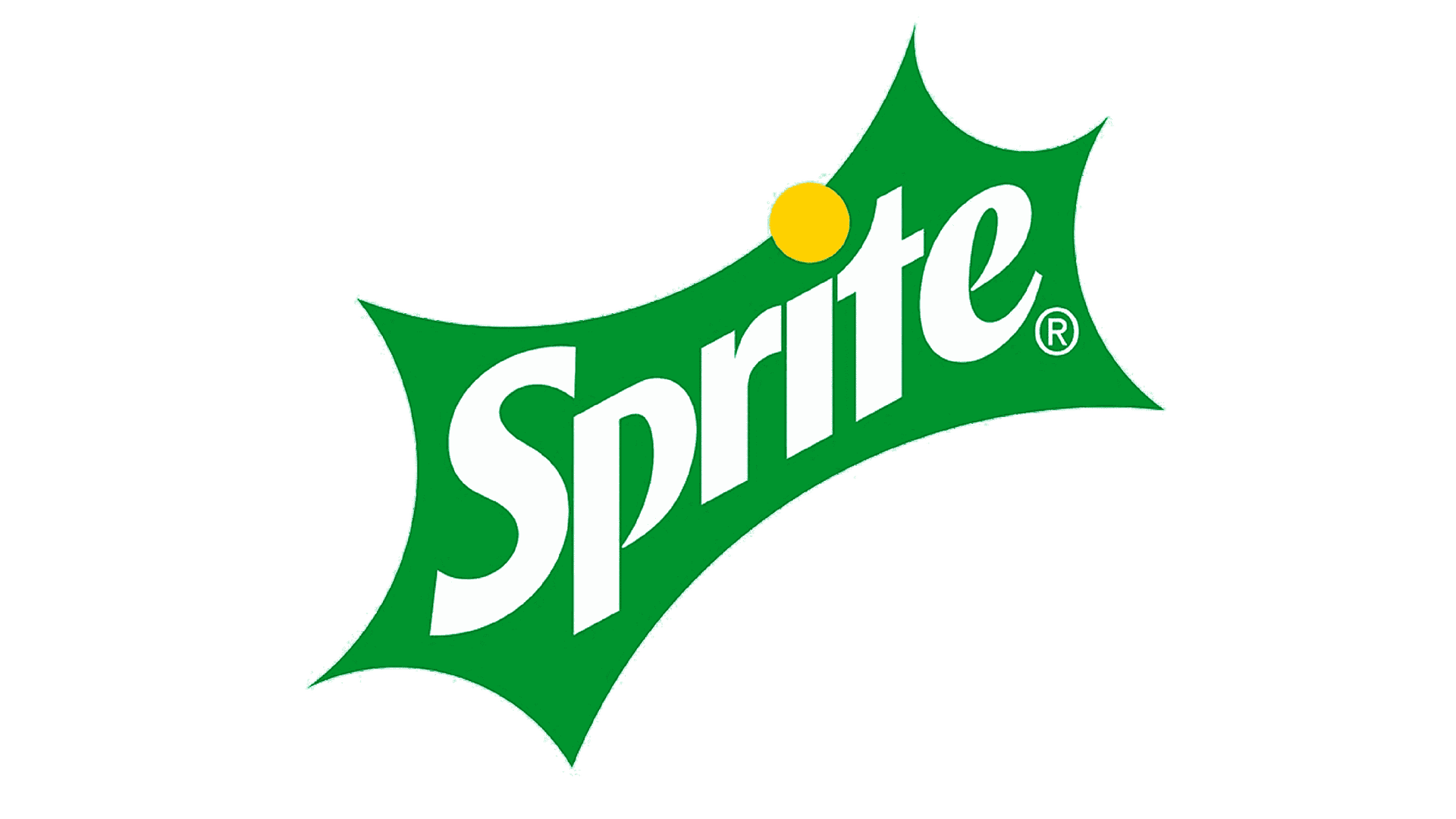
Yellow And Green - Evoking Freshness And Growth
Yellow and green, two colors symbolizing nature, bring a sense of freshness, purity and prosperity.
Example: Sprite
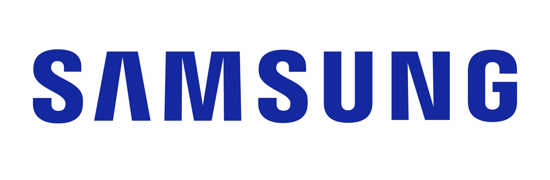
Blue And White - Representing Trust And Purity
Blue, the color of the sky and the ocean, represents trust, stability and professionalism. White symbolizes purity, clarity and simplicity. The combination of blue and white exudes elegance, modernity and reliability.
Examples: Oreo, Samsung

Black And Red - Creating A Strong And Luxurious Impression
Black is the color of luxury, power and mystery. Red is the color of intensity, strength and prominence. Combining these contrasting colors creates an impressive contrast, reflecting luxury, class and distinction.
Example: YouTube

Purple And Orange - Inspiring Creativity And Uniqueness
The combination of faithful purple and dynamic orange creates an impressive, unique and distinctive look. This color scheme is particularly suitable for brands aiming for creativity, innovation and personality.
Example: TPBank

3. Conclusion
Coordinating colors in a logo is an art, requiring understanding of colors, brand messages and sophisticated aesthetics. Ladybug hopes the above insights will provide you with useful knowledge about logo color schemes, helping you create an impressive logo that represents brand value and effectively attracts customers!
If you are looking for professional logo design services, do not hesitate to contact Ladybug. With a creative and experienced design team, we will help you create the most beautiful and impressive Mid-Autumn Festival packaging designs, making your products stand out in the market.
Contact Ladybug now for more details and consultation from us!